Why Hiring a Web Design Team for 2020 is Vital

2020 is predicted to see the greatest increase in technological advancements in digital and online platforms so far, from shopping orders to social media, it is becoming increasingly vital for companies to maintain a strong online presence when it comes to marketing their business. With technology on the rise daily, companies will gain more and more opportunities to expand and compete digitally. Many don’t see the importance of having a website, and the idea of creating one can appear daunting so they either avoid doing it or hire someone who isn’t an expert.

You may be thinking why bother or why hire a designer? If you’re nervous at the thought of moving your company online, this article is here to tell you why you needn’t be sceptical. We are here to help make the transition as easy as possible. And with 3.8 billion people across the globe currently using the internet, there are so many opportunities available online to help you access new customers and clients. Marketers and potential clients use the internet to find companies they can trust, and having a well established site shows credibility.

All businesses need a website to successfully market their brand online. Without one, many customers and clients will feel this reflects badly on how up to date you are with running your company. And with the competition being high, you want a site that wows. If your website is poorly designed, it will directly reflect badly on your brand. If the site is old and outdated, it will immediately put customers off from visiting your site. A website always needs to be user friendly. Customers must be able to clearly see what it is your business does, access any information on products and sales, as well as be able to find contact details easily. If they are unable to do this, you are at risk of customers not being able to contact you, you could lose sales and be subject to bad reviews online and a bad Google ranking. In fact, whether you have a good website or not can be a deciding factor in whether your business fails or succeeds.

Relying on someone who isn’t trained in web design to design your website can not only leave you out of pocket with a poorly designed web page, it can leave you without reliable support or technical help if things go wrong. A lot of sites offering downloadable website builders do not offer you the advice or guidance to support a professional web build, they offer very basic designs at high prices, and many don’t allow support for video, RSS feeds and other links. Professional web designers are kept constantly up to date on current trends and developments occurring in the world of web. Knowledge on the latest news and developments enables them to directly create websites and programs specifically targeted to your brand or business. Professional web design is worth the investment when looking at high quality, custom built design. And at Moocow we don’t just design your website, our packages include domain and hosting, coding, optimisation, user-bility, research and strategy, development, SEO and UX, and eCommerce integration. Our professional design team provide friendly, consistent and ongoing technical support, and are able to offer advice and knowledge when something goes wrong. The benefits of having qualified developers help you make the move into going digital are huge. We love being able to watch the businesses we have helped thrive and expand their brand successfully. So if you’re yet to take the leap into creating a website for your company, or have been anxious about making changes to your current site, we hope our advice puts you at ease and helps you get a few steps closer to making the most out of your business.

Web Design Trends for 2020

As we approach the last stretch of 2019, businesses and designers alike are preparing for the creative trends set to take over 2020. With AI and interactive design becoming an evermore sought after technology, it’s not surprising that plenty of new web design features plan on largely incorporating websites with voice user interfaces, chat bots and other similar functionalities. But what else is trending?

It’s predicted that asymmetrical designs, broken grid layouts and microanimation will all be trending components for leading web design for 2020. A continuing popular feature is bold colours and minimalist layouts, which are proving to be a persistent theme from previous years. Take a look below to see some of the most in-demand styles and layouts to help you have that light-bulb moment and get your website prepped to be ahead of the game for the new year.


Microanimations and Illustration

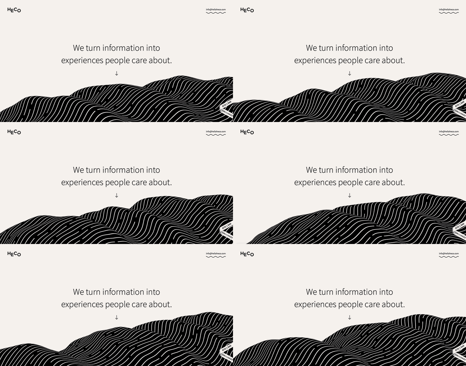
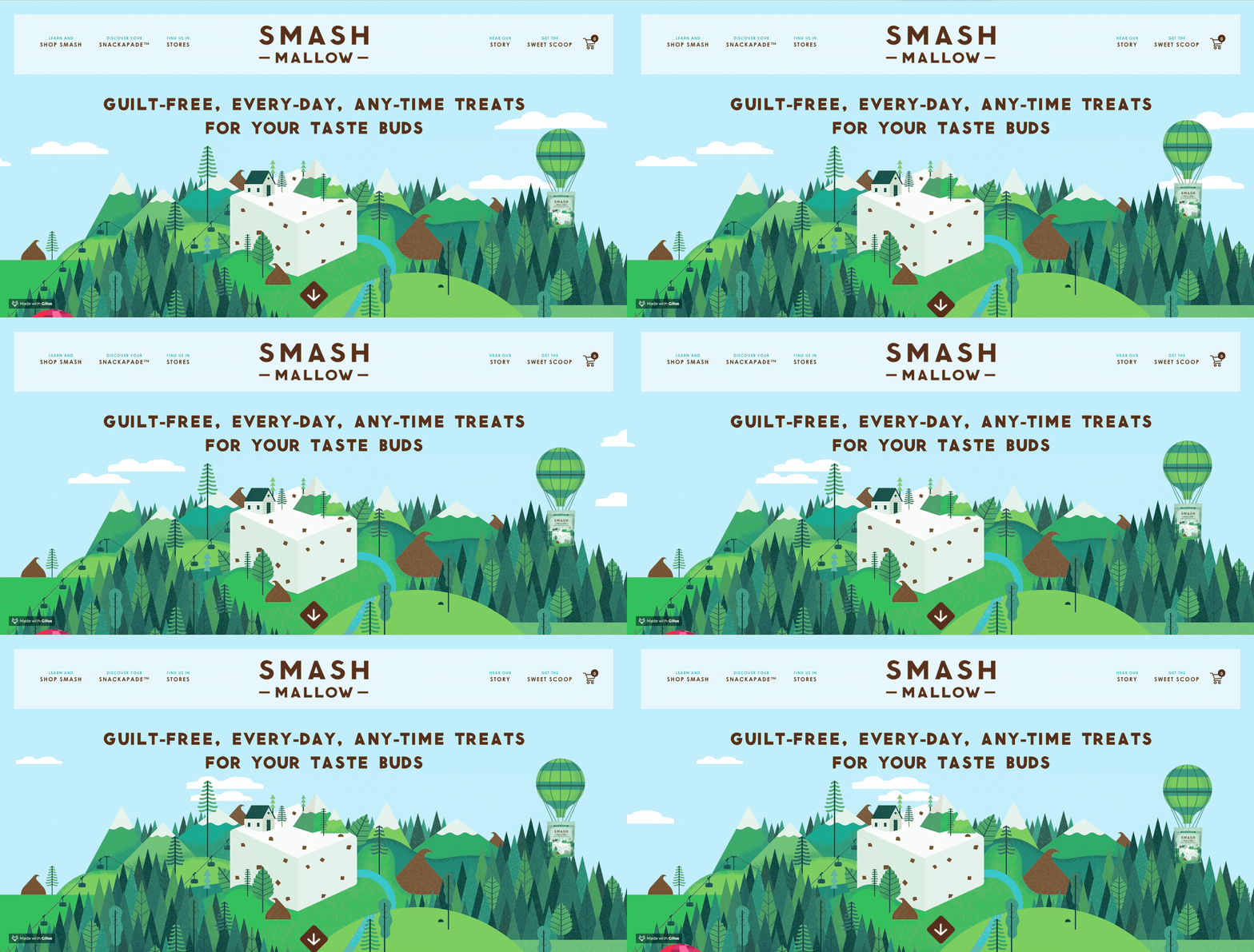
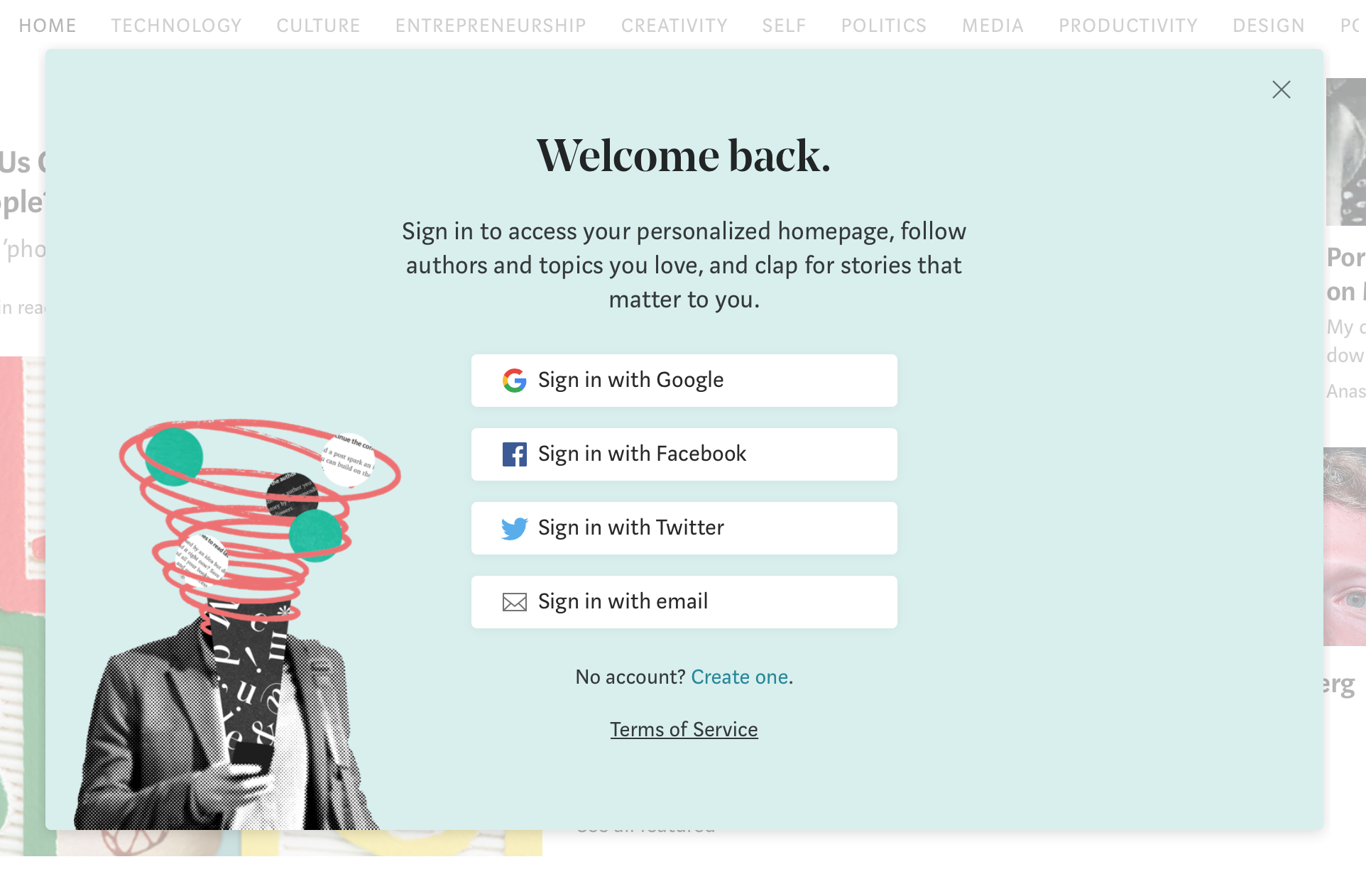
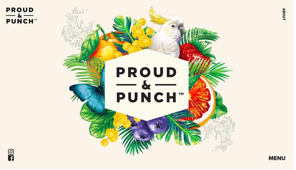
These subtle, yet hypnotic creative twists to your web page design, can make all the difference in capturing a new audience, as well as showcasing your talent digitally which enables a sense of professionalism, no matter what industry you’re working in. Audiences like illustrations and animations that are unique, bold, colourful or fun, and add that little bit extra to help show personalisation of your company or products.


Source: Heco

Source: Ariel Wollek/Wix

Source: Smashmallow/Gifox

Source: Webflow

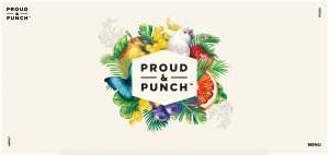
Source: Proud & Punch


Minimalist Layouts

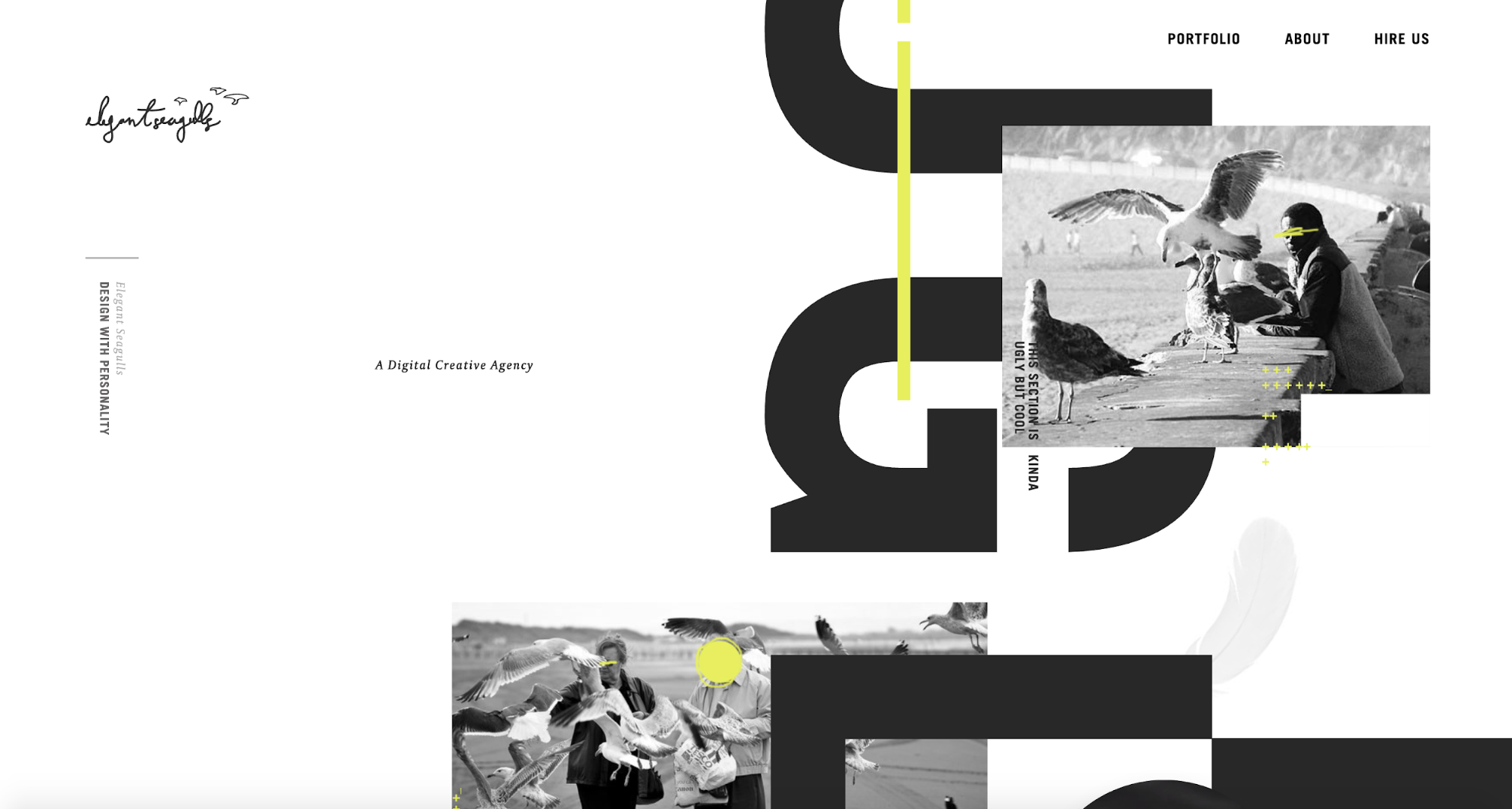
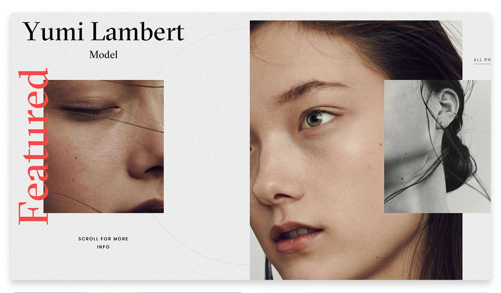
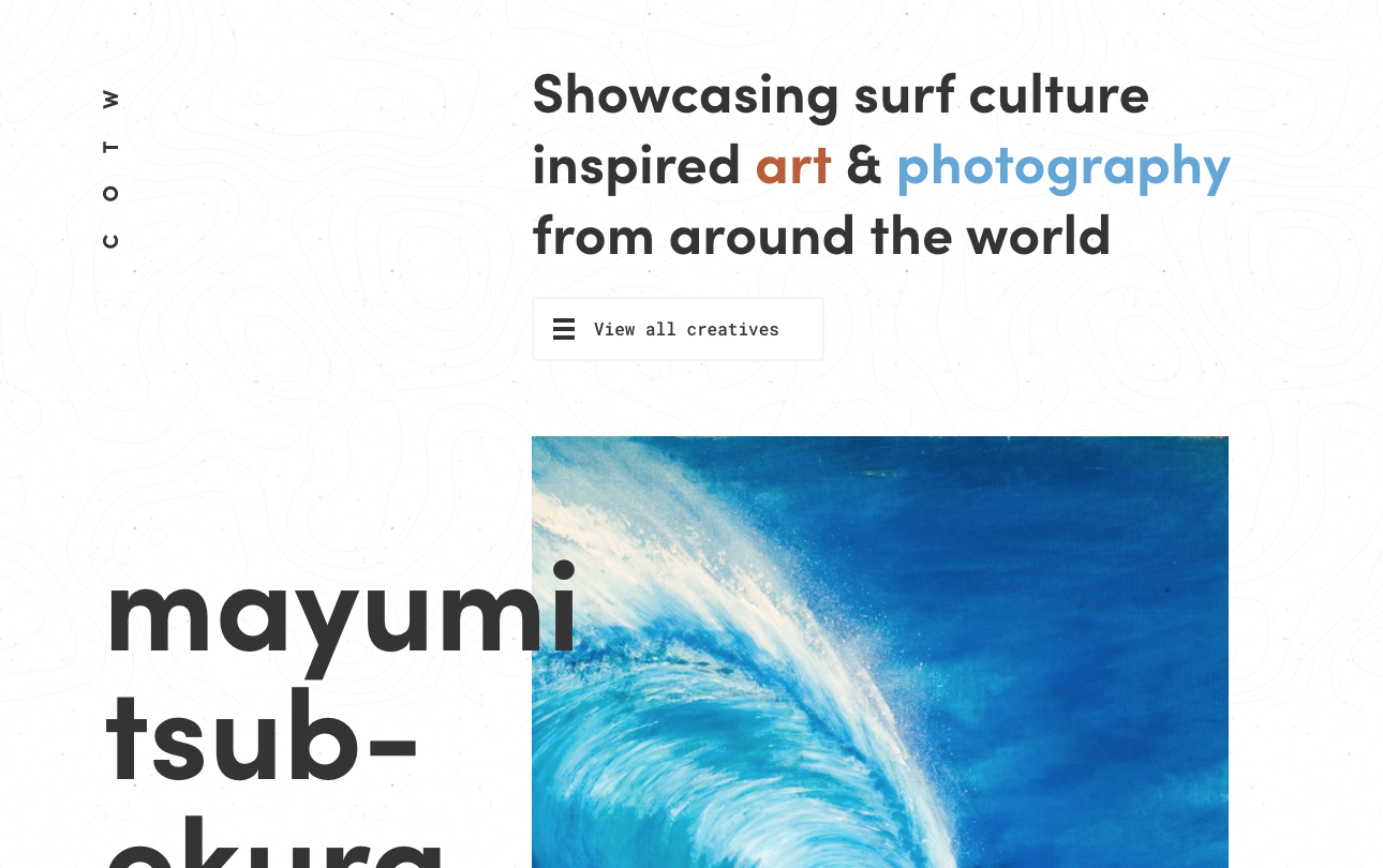
Minimalist layouts allow for a stylish, sleek finish. Aim for homepages that aren’t text heavy, focusing more on visually appealing to your customers, whilst still bearing in mind the importance of a fast loading web page. This style of layout is great for not overloading the viewer with too much information, and works great for artistic or creative businesses looking to keep their site chic, but simple.


Source: Elegant Seagulls Design

Source: Yumi Lambert

Source: Club of Waves


Bold Colours and Typography

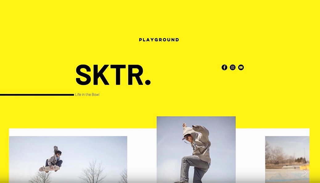
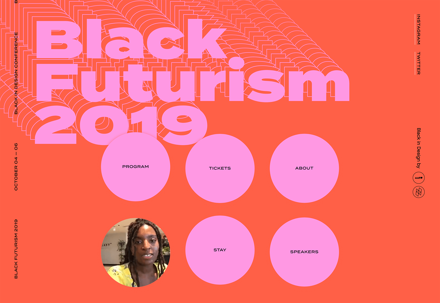
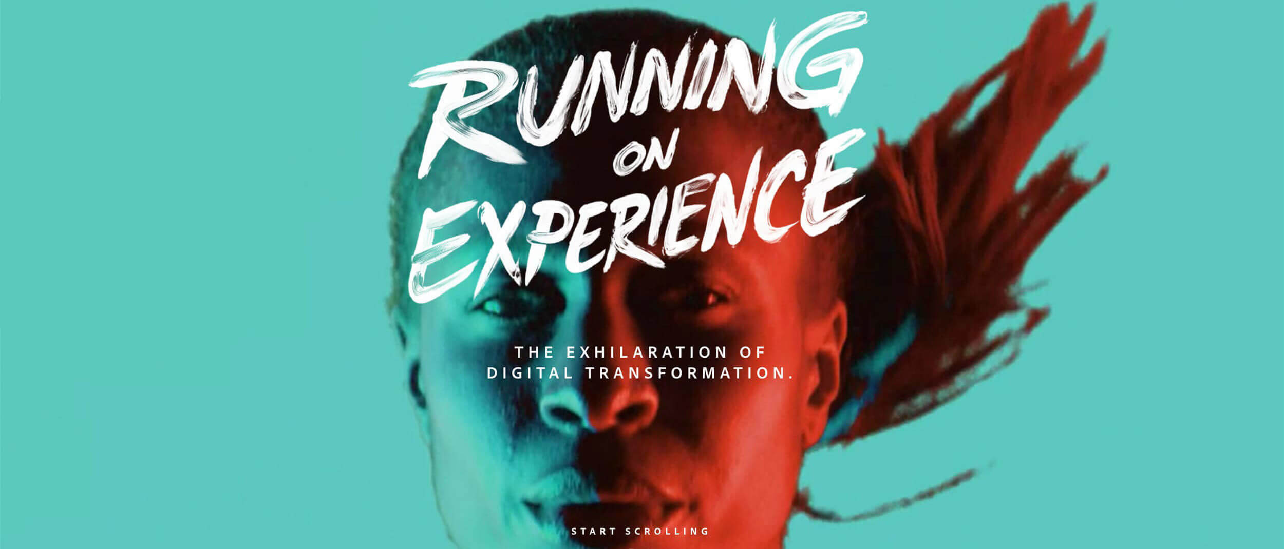
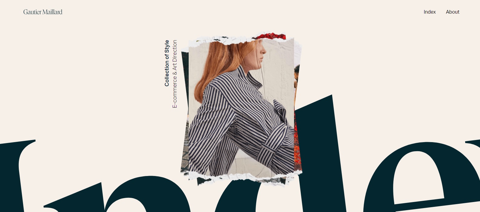
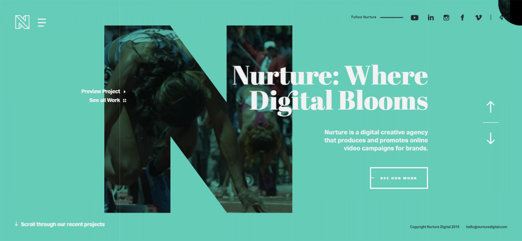
Bright colours and bold typography, with geometric, sans-serif or freestyle fonts are particular favourites for graphic design in 2020. Colour is psychologically proven to have a relationship with mood and has been used as a clever marketing tactic in advertising for years. Making your home page proudly loud is a great way to draw in viewers and mesmerise customers with websites dazzling and dripping with colour.


Source: SKTR./Awwwrds

Source: Black Futurism Festival 2019/WebDesignerDepot

Source: Adobe

Source: Gautier Maillard

Source: Nuture Digital

Why Bespoke Illustrations are Trending in Web Design

At MooCow, we pride ourselves on having the most up to date knowledge on the hottest web trends. With technology and techniques developing daily, take a look at what 2017 has in store for the world of web design.

Whilst many businesses are still opting for a traditional approach of plumping up their sites with bold typefaces and pristine layouts, others are jumping on a slightly different bandwagon. Hand drawn illustrations are a hot pick for up and coming web sites, with many of the creative industries choosing to adorn their sites with hand drawn graphics and typography.

Not only is it a fun way to personalise your site, it allows your web page to be custom crafted and show off your talents if you’re a master doodler yourself. Brands often set themselves apart by having unique and off-beat logos, designs & layouts, so you never know – having your web page plastered in drawings and free-style artwork could actually make you the next web page super star.

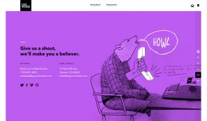
A few of our favourite sites that showcase some serious talent when it comes to illustration include Legwork Studios, Future Living and Proud & Punch. Take a look at their sites or have a look at the Awwwards site for award-winning design inspirations.


7 Simple SEO Tips to Help Promote Your Website in Under 30 Mins

Since opening its doors in 2006, Moocow have been working hard growing and developing our client base & expertise, offering a dynamic blend of creative thinking, experience and technical know-how. Here at Moocow we are dedicated to helping you get the best out of your website. We are proud to have produced amazing websites for our clients that boosted their brand and helped their businesses blossom. With these 7 simple tips we can help you be well on the way to efficiently marketing your website in as quick as 30 minutes.

1. Pick the right domain name
Making sure your website has a relevant URL is the first thing that stands out about your business. When clients go to search for you, they want a domain name that’s easy to understand and quick to search. It’s vital to pick this out before your website goes live, if you’re part of a company or brand it’s best to stick with whatever your company name is or at least a keyword or name that is relevant to your business. This is also the first place Google goes to determine exactly what your site’s about before choosing how to rank it. Make sure not to include any special characters/hashtags and remember to make your domain stand out from the crowd.

2. Create page titles and descriptions that help get you recognised
When creating a website, we will ask you to supply chosen titles for each of your web pages and a brief description of what that page includes. If you’re unsure of the importance of page titles and what exactly it is they do, hover on an open tab in your web browser and it will show you what title that page shows up as in search engines. The same goes for your page description – although you can’t see this personally, Google uses this description to filter down what your page is about. When your site is finalised and is picked up by Google, your page title and description is what viewers will first see when searching for relevant interests, so they will immediately know whether your page is something they are interested in or not – this is why it’s vital to make your page titles and descriptions relevant to your business.

3. Design your website around keywords
Keywords are important to your website as this is how Google directs searchers to your site when looking for similar interests. Picking keywords for your specific industry is helpful in putting you on the map and getting you the right attention. You can use free programs like Google AdWords to help you understand how and why keywords are important to your business. Use their Keyword Planner to access suggestions for keywords related to your business, helping your company reach the customer audience you’re looking for. AdWords also offers other options and extras you can pay for to give your site an extra boost such as graphic display ads, YouTube video ads or in-app mobile ads, so you have plenty of choice in how to reach out to your target audience.

4. Add text to your images
In the same way as mentioned above, picking keywords relating to your site is super handy for when customers want to search for you. This also works with images. Any image that you’re choosing to upload to your site, be sure to add a few words about each image that both describe the picture and are catchy to your search engines. Remember to always pick the right file name for your image and reduce file size for faster loading. Google states that the main reason a searcher leaves a web page before viewing the whole site is due to pages taking too long to load, which is often due to image files being too large to load quickly.

5. Anchor text can be helpful in guiding viewers around your site
A popular tip to get your website more noticed is adding anchor text to a page. Anchor text is where you click on a section of text highlighted in a ‘hyperlink’ or button that takes you directly to another page on your site or link to any other page on the web. It’s useful to use a short phrase or keyword relating to the subject of the page. It’s also helpful to choose words that are popular to your business or industry and are regularly picked up by Google. Despite being a clever trick to boost SEO, some sites go overboard with this however, which is something to avoid. Over use of linking can show up as a red flag on Google.

6. Get advertising through Google
If you want to maximise your chances of getting your business showing up in SERPs (Search Engine Results Pages) it’s a good idea to promote your brand on Google owned sites such as YouTube and Google Maps. Google pushes far more traffic towards websites that they own, so this will be an advantage for your company. A particular ‘must have’ for your business is setting up a profile on Google My Business. If you’re unsure what this is, this is the selection of info that pops up as a square in the right hand corner of your Google search on the web browser that shows the name of your business, photos, contact details and reviews. If your business has a lot of video related content that you use to promote your products or brand, setting up a YouTube channel can also add a large amount of viewers to both your website and help promote your products.

7. Mobile first sites are always top
Mobile-first responsive web design is now becoming a mandatory requirement for most sites. Over the last couple of years, there’s been a giant leap in what we call ‘internet browsing behaviour’, with thousands of people swapping from desktop to mobile technology. Google now gives preference to mobile friendly sites, prioritising mobile sites over desktops, and by the end of 2018 it’s predicted that 70% per cent of online shopping traffic will be mobile. Google’s Webmaster Blog stated “our algorithms will eventually primarily use the mobile version of a site’s content to rank pages from that site, to understand structured data, and to show snippets from those pages in our results.”

4 ways to maximise site security and prevent hackers without impairing UX

At Moocow we’re all about knowing what’s best for your business, whether it’s the latest updates, design tips or marketing tactics. And when it comes to getting you your perfect website, we pride ourselves on making sites that are both manageable and secure.

Following the launch of the European Union’s General Data Protection Regulation laws (GDPR) which began May 25, everyone has gone a bit security mad, and businesses seem to be packing their site with security options that aren’t often necessary. This can in turn lead to problems with the speed of your site as well as making it easier for hackers to access your web page details. Our aim is to help you understand security options for your site clearly, allowing you to cut through the confusion and get to grips with the lingo, making it that little bit easier. Obvious options to take such as ensuring that your software is always up to date and backed up, are implemented by most. Below however, are a few simple steps you may not know about which may help pin down some good ways to make your site secure, without putting off customers to your site.


Restrict Your Plug-ins

We know it’s tempting, but try not to overload your site with various security plug-ins. Do your research, and pick two or three at most that do the job efficiently. Too many plug-ins will slow down your site and leave it vulnerable to hackers trying to access your private data. Researching what security plug-ins work the best and comply with GDPR regulations is the best way to establish this. It’s easy to be tricked by advertising telling you you need all sorts of different plug-ins, but ultimately many will end up doing the same thing, and it’s easy to find just a couple of plug-ins that will cover your site securely.


Use reCaptcha

When accessing a site, most of us know how frustrating it is having to declare we’re not a Robot… However, using reCaptcha does comes with a lot of benefits. It’s extremely helpful in protecting you from up to 95% of spam and data hack attempts. One downside is, using reCaptcha can have the potential to slow down your site. It’s a bit of a double edged sword. There’s both pros and cons to using it, but overall we feel the benefits outweigh any of the speed issues that may or may not crop up.


Implement Two-Factor Authentication

This method of security has become much more popular recently, especially with larger businesses and sites that hold especially personal data. For those who aren’t sure what this means, it’s pretty much the same as having to show two forms of ID when confirming your identity. In this case it will usually take the form of a password, and a personalised security code sent by text message to your phone. You’ll then be asked to submit this code on the website. Two-Factor Authentication can help significantly reduce the likelihood of hackers being able to impersonate your identity and log in to any accounts or personalised info.


Add a Concealed WP Log In Page

Most hackers will try to get into your site through your WP log in page or dashboard.

WordPress websites primarily all have a universal login URL of /wp-admin/ making it extremely easy for hackers to go directly to your log in page and use brute force cracking to hack your page. This is a trial and error form of hacking used to decrypt passwords and other types of log in details. To prevent this from happening, you change your URL to something more personalised using plug-ins such ManageWP. It allows you to customise your log in URL to something harder to guess, an easy example being /my-concealed-login/ but you can change it to whatever works best for your business. It may seem like a bit of a hassle, but doing this has the potential to stop almost 100% of hackers accessing your page.


Our Design Process – What We Need From You

MooCow is an interactive website design agency, based in Brighton & Hove. Since opening its doors in 2006, we have been working hard growing and developing our client base & expertise, offering a dynamic blend of creative thinking, experience and technical know-how. If you’re currently considering working with us, below is a basic guide to what we need from you as a starting point to help create your web page.

– Your company name and a brief list of words relating to your business and industry. For example, we’re a web design company, so we would choose specific words that we want Google to pick up relevant to our business.

– A short description or paragraph about you or your company – who you are, what services you provide, or a little bit about your company history.

– Have a think about what pages you would want to feature on your site and titles for them to appear on a menu. This could be an ‘about us’ section, ‘services’ or ‘portfolio’ etc.

– Drop us a link of an example of a web design style you like, this will give us a better idea visually of the look you are trying to achieve for your site.

– If you’re wanting a specific logo used, send us over a copy that is hi res with a white or transparent background and at least 600 pixels wide. Save this into either a png or jpeg file. For ‘favicons’ your logo will need to be sized to 512×512 pixels. If you want to test drive a new logo, let us know and we can design you a fresh one.

– Any text you want featured on your site, paragraphs about you, your company or the services you provide, send this over too in a word doc or pdf file. If you’re struggling to put together what you’d like to say, don’t worry – our team can help in writing up some dazzling copy personal to your site.

– For images, be sure to pick only hi res images, approx 1500-2000 pixels in size saved into a jpeg or png file. You can also include a title or keyword that describes your images that SEO will pick up easier.

– Make sure to include any contact details you would like featured on your site, this includes a phone number, email address & location so that a customer can call or visit you.

– If you have any links to social media such as a Facebook, Twitter or Instagram page you can attach these too.

– Finally, a link to your RSS Feed/Blog if you currently have one active. If not we can make one for you to add to your site, so let us know if this is something you are interested in. The same goes if you are a business that sells products or other payable online services and would like a shop page included in your site.

The thought of creating a brand new website can be daunting, but don’t worry, our team of experts are here to help make the process quick, simple and stress free and give you all the guidance you need on the way!


5 Cost-Effective Alternatives to Photoshop for Professional Image Editing

When it comes to good design, we all love websites that are packed full of awe-inspiring imagery, and photos that really make you feel like you’re there in that exact moment. We can’t all have the skills of a professional photographer, but what we can help with is showing you how to edit your photos to a professional standard, without having a major price tag attached.

Don’t get us wrong, Photoshop is great. But not everyone wants to pay high prices when there could be a cost effective alternative. So after doing a bit of research, we’ve tracked down 6 Photoshop competitors, all with excellent editing tools and all at a much lower cost. And best off all, the majority of them are free.

Pixelmator (£28.99)

An impressive image editing app for Mac, Pixelmator offers fast powered tools to help alter and enhance images to make professional, high quality photos. The app has excellent retouching and special effects options, and tools to draw or paint. You can save to any format or upload on social media sites, and comes at the lower cost of £28.99.

GIMP (Free)

A free and open-source image and graphics editor, great for image retouching, free-form drawing, photo manipulation and adding graphic design elements. It’s available to download on a wide variety of operating systems, including GNU, Linux, OSX and Windows. A good option if you’re not in a position to invest any money on your editing tools.

Acorn (£28.99)

A nifty download for photo touch ups and edits with great options for creating photo collages, adding text and shapes, or creating new images. There’s plenty of instruments for editing, special effects and cloning. You can also remove image backgrounds and create logos with easy to use tools. Although not free, its price matches with Pixelmator and is still a fairly cost effect alternative.

Pixlr (Free)

An online photo editor that’s free to use and doesn’t involve a download. You can use this site anytime you pop online for quick image editing and touch ups. It’s equipped with all your general editing tools, and has options for creating fonts, logos, borders and backgrounds. A brilliant and cost effective alternative that will get the job done quickly too. You can download any images you create in various formats or upload online too.

Paint.NET (Free)

A free Windows download tool for image editing, Paint.NET is extremely easy to use and great for those with no image editing experience whatsoever. Although a fairly basic download, there’s still plenty of options for special effects, blending and layer adjustments. It also mirrors several of Photoshop’s classic tools such as curves and contrast control. A great download for minor tweaks and retouches.


5 of the Best WordPress Themes for Creating a Portfolio

At Moocow, we pride ourselves on having the most up to date knowledge on the latest web news, tips and trends. With technology and techniques developing daily, Moocow are continuously working hard to help find new ways to develop your business.

Our design team believe WordPress ranks above all the rest as a hosting platform. The open-source CMS works as an ideal model for creating a wide variety of sites for both small and large businesses, and is ideal for showcasing portfolios and products. Having a portfolio that’s professional, visually captivating and clearly showcases your work is vital for your business to achieve success and gain interest from new clients. So below, we’ve hand-picked some of the best WordPress themes for putting together a high end portfolio, that will grab your audience’s attention and gain you new clients and sales.


Oshine

Creates beautifully fresh and contemporary portfolios with 12 unique layouts to choose from. Comes with access to over 500 fonts, colour choices, shortcode modules and so much more. Oshine also supports a large variety of plug-ins, including WPML, BuddyPress and Gravity Forms. A great choice if you’re looking for a stylish and modern way to display work visually.


Adios

A great theme that’s easy to use, extremely fast loading and is ideal for those working within the creative industry. An elegant and artistic approach to portfolio design, you’ll have access to hundreds of fonts, colour choices, layout elements and designs and you’ll be able to use a variety of great options for animation. Adios allows for superb compatibility with all devices and browsers, and will ensure your site is noticed worldwide.


Art.

Perfect for colourful, chic and customisable design, this theme comes with a coding-free content builder for ease of use. Ideal if you’re looking for an artistic and simplistic portfolio design, it’s packed with beautiful layouts with drag and drop options, fashionable headers and plenty of options for blog posts. You can also create stylish home sliders to showcase large images, and with SEO by Yoast you’re sure to have plenty of great options for getting noticed in search engines.


Kalium

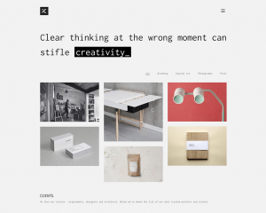
A sensationally designed theme for those looking for a cool and contemporary twist to showcase their work in style. With numerous options for layout, images and blog posts, this WordPress theme also includes Revolution Slider, allowing users to display work through slideshow. You’ll be able to personalise the slides and create your own unique animations and visual effects too.


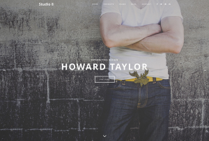
Studio 8

Rated as one of the best WordPress themes on the market, Studio 8 has a superbly sophisticated and stylish design. Beautifully fast and responsive, the theme provides great portfolio options to businesses of all backgrounds. You can upload custom headers and access built in short codes to make editing and designing easier. Known for creating attention-getting websites, this theme will help put your portfolio on the map.


Tips to Help Your Website Show You’re A Business Clients Can Trust

At MooCow, we pride ourselves on having the most up to date knowledge on web design. With technology and techniques developing daily, take a look at our tips below to see how small changes to your webpage can help boost your recognition as a company your clients can trust.

1. Keep your website as up to date as possible, a professional website should not only visually show off your brand, but also be easy to access. Making sure your site is regularly updated, fast-working and mobile friendly are the best ways to ensure a reliable site.

2. Clearly outline who you are as a business, show your customers you have nothing to hide. Make sure your site has a clear ‘About’ section so your clients have a good understanding of what services you provide, your mission and goals. Always be true to the values advertised on your site.

3. Show off your credentials, make visible any companies you have partnered with or worked for. Provide proof of any qualifications or awards your company has received, recognition allows for your company to be seen as dependable as well as capable of providing an excellent service.

4. Be direct. No one wants to find out about hidden costs further down the line, hidden in small print. Make sure you stand by any promises stated on your web page. With online shops, make sure details like shipping, cancellation, return policies are all clearly visible with no hidden. Make sure customers can contact you easily, always have a contact number or email address listed on your site that is kept up to date so any queries can be dealt with rapidly.

5. A strong social media presence helps back up who you are. Social media sites such as Facebook, twitter and Instagram are the first place potential customers are going to head to, to check out your authenticity. Having a varied amount of reviews and testimonials from previous clients can help to give proof your company can be relied upon.

6. Vocalise your brand’s mission statement, personalise the values and ethics your company holds, speak to your clients in a relatable manner and get your audience interested in what you do. Use examples, statistics and present data visually that will showcase exactly what your company can achieve.

Using Instagram to Boost Your Brand

Instagram – the world’s most popular photo sharing app. With 300 million monthly users, the social media site currently has a larger following than Twitter, and its followers are constantly growing. With our easy to use guide, Moocow can show you how to use Instagram to help utilise your social media skills, boost your brand and get you the followers you deserve.

A large majority of online shopping traffic occurs through social media, sites like Pinterest and Etsy have made online shopping even more popular, with buyers being drawn in by adverts and promotions that are visually exciting. Instagram is paving the way for businesses to show off their creative flair, allowing consumers to see a more personal side to how their company works, as well as showing off what their brand has to offer. Below are 5 ways you can improve your site following using Instagram.

First steps – setting up your account!

If you’re already an Instagram user, be sure to keep your personal account separate when setting up a new account for your business. This enables users to identify you and your brand as separate, and allows for any embarrassing selfies to be posted completely out of eyesight of any potential clients. Use your brand logo throughout your page and as your profile image so viewers can establish that your Instagram directly relates to your company. Make sure your bio is short and sweet, but packs a punch. There’s a million or so users out there, you want to make sure your company stands out from the crowd. Last but not least, always attach a link to your website – whenever a user views your profile, it directly boosts traffic to your site.

Make an impression

Be big, beautiful and bold! Boost your brand by using product shots that are eye catching, colour co-ordinated and fun to create. Believe it or not, certain colours are actually more of a hit than others on Instagram, with blue being one of the most desirable colour trends with followers. When creating adverts always use HI RES professional photographs, opt for a text overlay on one of Instagram’s photo editor apps to create quick and trendy ads.

Identify trends

Keep up to date with what’s hot on Instagram – which users, hashtags and themes are trending. Do your research, take a peak at your favourite brands, look into companies similar to yours and see what gets them plenty of likes. What styles of posts are popular? The main aim is to boost your brand professionally, but customers and clients want to see you have a fun side also. Outdoor shots that show your customers actively using your products are a great way to show off your adventurous side. Whether you’re having some downtime with your team, or are busy getting creative in the office, these are great opportunities to capture your company’s creative side on camera.

Get #Hashtagging

When posting your pics, pair catchy descriptions with relevant, trending hashtags. Picking a popular hashtag allows any user across the world to view your post. Use hashtags that relate to your area of business, such as company name, location, what you’re doing, and words that describe exactly what you’re posting. Research hashtags that are currently trending, be it colours, days of the week, events or features in the news, and use these to help shape the audience you want your post to reach. Use a minimum of 5 to help boost your audience range, so don’t be shy. You can even create your own hashtag relevant to your business name.

Network

Get networking! Make sure to share on other social media platforms your company uses such as Twitter & Facebook. Encourage clients to share, like and comment on your posts, and return the favour too! Keep an eye out for new business opportunities by connecting with new users and building a rapport with relevant brands.

"hans-vivek-208969/