
At Moocow, we make sure you’re up to date with all the latest UX/UI know-how, ensuring your site gets the attention it deserves. With technology and techniques developing daily, take a look at what 2020 has in store for responsive design.
For web design newcomers or those looking to get an insight into how we create our sites at Moocow Media, responsive design is fundamentally the method of using CSS to generate a web page which re-adjusts and arranges itself to display its content correctly on any sized device. This technique works side-by-side with mobile first.
Companies now only need to buy a single site which squeezes all the best info from your web page and efficiently displays readable content on any gadget, whether it’s a desktop, tablet or mobile device. Not only does this save you a small fortune, it also allows customers to benefit from having a website that will allow Google to enhance its rankings. And as Google now only promotes sites which are designed for mobile devices also, it’s really the only choice for your website. Sites that aren’t mobile-friendly will be digitally wiped off the map.
Mobile First
Over the last year we’ve focused a lot on the importance of making sure your website is mobile first. And with m-commerce transforming and developing daily, making sure your site is mobile first is vital for the successful functioning of your business and web page. Mobile transactions are set to rocket in 2020, with the vast majority of orders already being made from mobile devices accessing your website. So if you’re still yet to update your site to mobile first, make this your new year’s resolution. Making sure your mobile site is responsive and easy to use is a number 1 priority, otherwise you risk customers not even being able to access your site in search engines at all.
Thumb-Friendly Mobile Navigation
2020 will see a step up in simply focusing on previously making your site mobile first. Sites are now being challenged with the task of making mobile sites “thumb-friendly” allowing for better ergonomic use, “user-friendliness” and increasing the ability to access site navigation with greater ease.
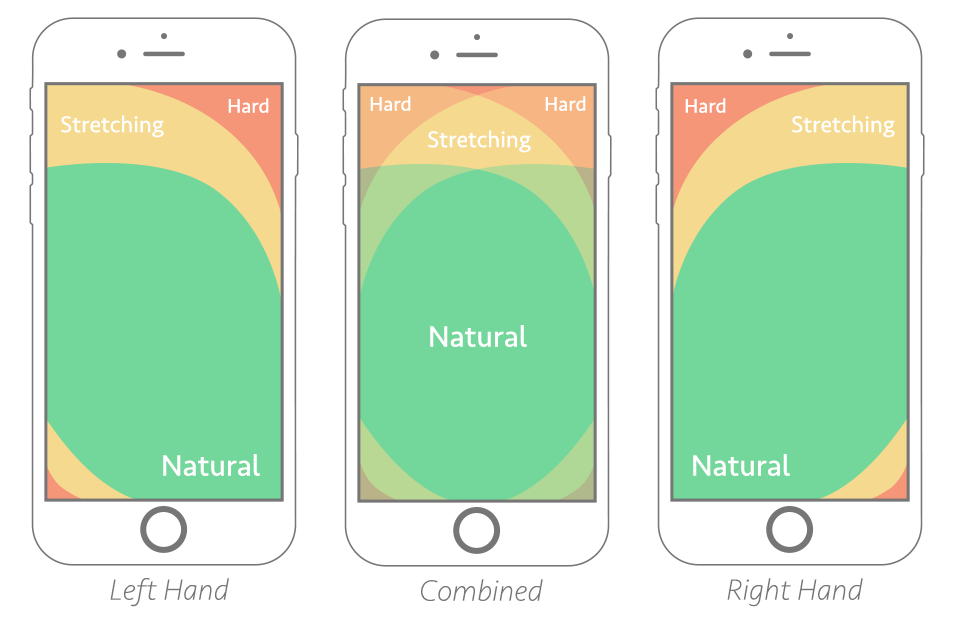
Source: Smashing Magazine
The above diagram shows a good example of how our hands naturally grip our phones and the restrictions in our thumbs natural manoeuvring across phone screens. Opting for bottom hand corner navigation, for menus, social media or contact buttons over traditionally placed top, right hand navigation could significantly help to improve UX. These changes might seem simplistic, but all add up when combined in providing a website that’s both customer and Google friendly.